Hisami game TouhouFest 2024 update
Table of Contents
- 1. Dates / deadlines
- 2. Fancy distribution methods
- 3. Changes to the structure of the game
- 4. New environment suggestions
- 4.1. Bamboo forest
- 4.2. Eieitei (from the jam version, preferably with some extra decorative tiles. Carpets would be nice to guide the player's eyes.)
- 4.3. Touhou 8: Imperishable Night stage 5/6 infinite space corridor
- 4.4. Autumn!
- 4.5. Heaven
- 4.6. Hell/Higan
- 4.7. Madness / Hisami's subconsciousness
- 5. Suggested NEW tile types (game mechanics)
- 6. Extra requirements due to moving enemies and blocks sliding on ice
- 7. Technical requirement on tilesets
1 Dates / deadlines
- TouhouFest 2024 is April 27-28th. Game needs to be done at least by then, or even earlier depending on the form we want to distribute the game in. (CDs, etc).
- If we just distribute by a download link, we could finish the game the same day, worst case. It's also the easiest way, but harder distributions methods might be more fun and feel more valuable to the con goers.
2 Fancy distribution methods
2.1 CDs
A quick search gives me https://www.blankmediaprinting.com/cd-printing-custom-cd-labels these people can print CDs in jewel cases for $2.39 (for 25-49 CDs, it gets cheaper if we do more). They can print booklets to go with the CDs for a few 10 cents extra per CD. For convenience, we could add a download link in the booklet. There are a ton of other options and we probably want a handful of them. Each add a few 10 cents. With taxes, it might go as high as $4 per CD. I think Aeon also can print CDs, but I'm not sure if he can do artwork, etc? If it's just a matter of burning a CD, I can already do that, but unless we do something to decorate the CDs by hand, I don't think a plain burned CD adds much value over a simple download.
2.2 Nice looking print card with a download link
Similar to the cards Rak distributes, or just a business card. We could ask Rak what he does. Seems like we can get 100 cards for $19 here: https://www.zazzle.com/book_launch_author_promotional_book_cover_business_card-256986777803860614
2.3 USB stick
Probably prohibitively expensive, even for uselessly small USB drives? The cheapest on Amazon are like $6, but we'd want customization to make it feel special and specific to our game.
3 Changes to the structure of the game
As the game will have more levels, a save feature will be essential. A level select feature would also be nice, perhaps it could be unlocked as a reward? Unlockable features are a nice way to motivate the player. A level select feature is something we want anyway, and making it (easily) unlockable is a nice way to tell the player that "there might be unlockables if you keep playing", without us having to make an additional cool unlockable features.
Suggested additional unlockables (feel free to come up with more):
- CG gallery. If we have a lot of art, a CG gallery would work. If we can convince guest artists to volunteer some art, we could also include guest art here, but I'm not sure if that's realistic.
Just giving the player some unlockable every X level isn't likely to prevent them from getting tired of the game. Below are a few ideas on how to restructure the game to prevent player fatigue and increase puzzle-solving motivation.
3.1 Different difficulties
I like this because it's relatively easy to implement.
If we break up the game into different difficulty levels, each with about 20 stages, the player is likely not going to force themselve to play more than 20 levels at a time unless they really want to play more. This'll prevent fatigue.
A downside is that players may not come back for a 2nd play session, if they are satisfied with clearing on the lowest difficulty, since that alone would be a complete experience and may be satisfying enough to some players.
I'd like 2 to 3 difficulty levels (Normal, Hard, Lunatic?), where each difficulty is a completely different set of levels and you unlock higher difficulties by clearing the lower.
Each difficulty could easily have different tilesets and even different stories (but they don't have to), so it's a flexible game structure that can be adapted to any level of effort.
3.2 More story focus
If we somehow can come up with an intriguing story, it'll provide the player with external motivation which might let them overcome puzzle-solving fatigue. We'd drip-feed them story at regular intervals. Perhaps by having them talk to NPCs during the levels or through cut-scenes. The great difficulty of this approach is to come up with an actual story that's compeling enough to overcome puzzle-fatigue. That's not an easy thing!
4 New environment suggestions
These are suggestions, not a list of 'requirements'! If we don't pursue the story heavy game structure, any environment you want to do could probably fit, especially since we're not restricted by the 'immortality' theme. (If someone comes up with a good story, that's a different matter, as the tileset would have to support the story.)
Each environment would likely need a tileset for walls, floors, holes and perhaps alternate sprites for some of the special tiles like gates, buttons, blocks, hookshot pole, 'goals' (Mokou or Kaguya in the Eientei tileset). Always nice to have but never required are just random decorations that can be sprinkled on top of the levels. Some things can probably be reused between tilesets, especially if we just make versions of the Eientei tileset.
There is no shame in being lazy. Ignoring this list and just palette swapping the tileset we have is acceptable.
I've listed the technical requirement of the tilesets in a separate section. Here we merely brainstorm ideas for game environments.
4.1 Bamboo forest
4.2 Eieitei (from the jam version, preferably with some extra decorative tiles. Carpets would be nice to guide the player's eyes.)
4.3 Touhou 8: Imperishable Night stage 5/6 infinite space corridor
4.4 Autumn!
Eat the grapes on Minoriko's hat.
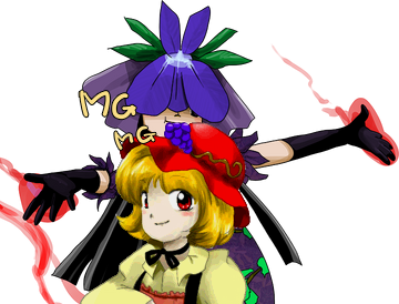
Figure 1: Hisami enjoying some grapes after restraining Minoriko.
4.5 Heaven
Eat the peach on Tenshi's hat.
4.6 Hell/Higan
Could be about stopping Mokou/Kaguya from escaping. Or just about breaking out of Hell yourself so you can get scolded some more.
4.7 Madness / Hisami's subconsciousness
First stage(s) of campaign starts as normal Eientei, but then Reisen appears and hits Hisami with her 'lunatic red eyes'. The rest of the campaign takes place in some lunatic fever dream. Could use a mishmash of other tiles floating in a void. (These kinds of dungeons are very popular late-game dungeons in JRPGs for a reason, becasue it's a good way to reuse assets.)
Two potentially different flavors of this idea (that could be combined):
- Focus on the external influence (Reisen): large red rabbit eyes, perhaps during stage transitions, perhaps always in the background.
- Focus on Hisami's mind: fill the stages with things on Hisami's mind. Like grapes, peaches, bamboo, Zanmu. Could be erotically charged, since this is Hisami's madness-induced fever dream. (pin-up/swimsuit Zanmu posing with grapes, etc)
The first flavor works as it is: it's easy to understand since the player just got attacked by Reisen. The 2nd flavor would ideally be combined with some elements of the first flavor, to make it clear to the player that what they are seeing is a result of Reisen's attack.
5 Suggested NEW tile types (game mechanics)
The longer the game gets, the more important it is to introduce new kinds of puzzles, which is why I've come up with a few ideas for new tiles. That being said, the game is already complete enough that we don't necessarily need new tile types. Thus, you can pick whichever tiles you want to do sprites for, since none are strictly required.
5.1 Ice floor tiles
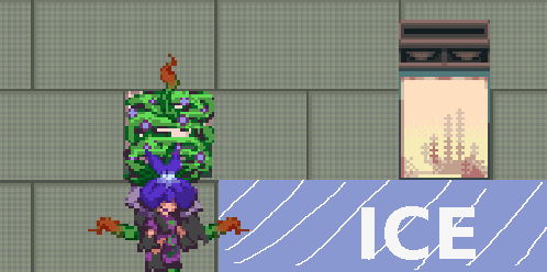
Figure 2: Example of Hisami using a grabbed block to setup an ice-slide that ends earlier due to a wall collision with a grabbed block. This allows her to stop and change direction earlier than she would without having grabbed the block.
Hisami slides until she hits something or lands on a normal floor tile or falls into a pit. There are some nice interactions with the grab mechanics, since we can grab blocks to effectively alter the shape of the player character to setup wall collisions to exit the slide.
Potential art complications: Pushing other 'blocks' onto the ice should make them slide as well. Fairies, Kaguya and Mokou and regular blocks are all 'pushable'. The fairies and Kaguya/Mokou may need a slide animation. Or they could just slide in their idle animation, perhaps with some extra effects? There are additional complications that arise due to having movement (here, sliding blocks) that is separated from the player movement. Since many of the same complications arise with having moving enemies, I'll discuss them in a separate section.
5.2 Enemies
Adding enemies would make the game feel much more complete and lively, and would add a nice action element to the game. Since enemies would move on their own (not tied to player movement), many of the same complications would arise as in the case of blocks sliding on ice. Again, see this section for a discussion of these complications. They may also need unique animations for when the slide on ice, since this is a special state where their AI doesn't apply.
Here, I'll list a few potential enemies. Personally, I think the melee enemies are more interesting, and it's also less work since it doesn't need a sprite that can face in all 4 cardinal directions.
5.2.1 Ineffective melee enemy
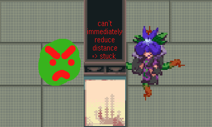
Figure 3: A predictable AI, that the player can plan around.
Tries to rush Hisami. Upon reaching Hisami or a vine block that is able to grab them, they get grabbed. Thus, they are not a direct threat, but they can make a level unclearable by forcing you to grab them.
Would use a very simple AI that just tries to reduce the smallest distance accorrding to
- Calculate difference between x and y position and Hisami's x and y position.
- If the y difference is smaller than the x difference, try to move towards Hisami in y. Otherwise, tro to move towards Hisami in x.
- If the above fails, try to move towards Hisami in the other direction.
- If you cannot move towards Hisami in either direction, don't move. This means that the enemy gets stuck in dead-ends.
Simple and stupid is good, because we want predictable AI for a puzzle game. However, this means that the melee enemy cannot be a smart character, like Eirin, which puts some minor constraint on the sprite.
Sprite suggestions:
- Eientei spriteset: a youkai rabbit with a pitchfork or some other (non-burning) melee weapon
- Autumn spriteset: Shizuha
- Any tileset: Murderous melee fairy
5.2.2 Effective melee enemy
Tries to rush Hisami. Causes DEATH if they touch her or ANY vine block. Same AI as the other melee enemy.
Sprite suggestions:
- Eientei spriteset: Youkai rabbit with a torch. Fire = instant kill if it touches your vines or you.
- Autumn spriteset: Shizuha with a torch? Perhaps something used to grill sweet potatoes?
- Any tileset: Any enemy with fire. A fairy with a torch would do.
5.2.3 Ranged mobile rapid-fire enemy
Tries to stay away from Hisami (melee AI in reverse, with some more advanced tiebreaker logic since the optimum is non-unique).
Fires fast bullets that can't break blocks, so you can block them by grabing or pushing blocks. Needs sprites that can face in all 4 cardinal directions, since it can fire bullets in all directions.
Sprite suggestions:
- Eientei: Reisen with her gun.
5.2.4 Ranged mobile bazooka enemy
Like the ranged enemy, but can break blocks. Just limited to 1 shot before it runs out of ammo? (Need a sprite to signify that it's out of ammo).
5.2.5 Stationary ranged rapid-fire enemy
Basically very similar to the fairy we already have, but instead of shooting a big bullet that can destroy blocks, it fires an endless stream of small faster bullets (that don't destroy blocks) that the player needs to seek or build cover from.
Since it doesn't move, it's not a large departure from how the game already plays, but it should be easier to add. Having to grab and push blocks as cover has nice interactions with the grab mechanics.
Sprite suggestions:
- A palette swapped fairy?
- A turret?
5.3 Fire

Figure 4: A fire can be used as a 1x1 tile.
Could substitute 1x1 wall tiles in certain tile sets. Could also be slightly different from regular walls, in that you can push blocks through them – but not blocks you have grabbed, as your vines will catch fire!
5.4 Wooden boxes
Gets destoyed by being pushed into fire.
5.5 Shadow Hisami
Face your inner darkness! If we go with the 'madness' level idea. Mirrors your movement. Palette swap of Hisami?
6 Extra requirements due to moving enemies and blocks sliding on ice
In the game as it is now, every movement happens in direct response to some player input, and all resulting movements are in the same direction that the player moved. When we add moving enemies or blocks sliding on ice, the following complications arise, and additional sprite animations may potentially be required:
Collisions when two blocks try to move to the same tile.
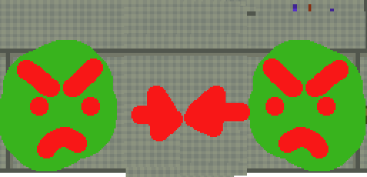
Figure 5: Enemies moving to the same tile during a time step.
What should happen if two blocks are made to move onto the same tile in a given time step? (NB: most of the game logic runs at a pretty low rate, a large fraction of a second. It's the time it takes for Hisami to move to a nearby tile.) Unless the objects can phase through each other, they shouldn't be able to stay on the same tile.
I have two ideas for possible solution. One is good, and one is probably bad (it'd be a lot of work).
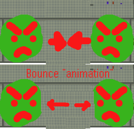
Figure 6: Solution 1: Bounce. They bump against each other and get pushed back to their original tiles. Nice and simple.
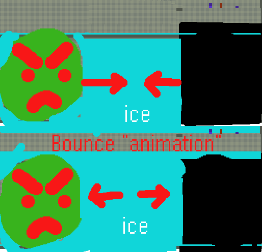
Figure 7: Advantage of bouncing is that it'd work between any kinds of block, and also on ice. Should perhaps reverse momentum on ice?
This is relatively elegant, and may not even require a new sprite animation if I just squish and move the sprites a bit.
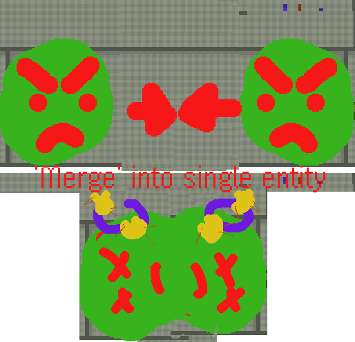
Figure 8: Solution 2: Merge. They merge into some new object that occupy a single tile. Here, they bump against each other hard, get knocked out and collapse into a pile on the floor on the tile of collision.
Even if every merge just results in the enemies collapsing into a pile on the floor, it'd be one or two new sprite animation for every pair of pushable/moving object in the game. Not a scalable idea, unless seija\real is crazy motivated.
7 Technical requirement on tilesets
I want to go into the technical requirements of the tilesets, since we might be creating a few of them.
First, a list of tiles/autotiles needed for each environment ('tileset').
- Floors: Floor tiles are manually placed, so no autotiling is needed. The Eientei floor tiles from the jam had two different version + a few different shadows. Ideally, the shadows should really be part of the wall tiles, or generally the sprite of the object that casts the shadow, but I didn't have time to figure that out for the jam. For future tilesets, we'll add shadows directly to the wall tiles instead.
- Holes: Holes for Eientei used a very simple autotile, where only the uppermost edge was different. This worked because the edges of the holes were perfectly straight and conformed to the grid of the tileset. This will not work for more organic shaped edges.
- Walls: These are the most tricky, especially if they are taller than a single tile and have shadows included.
- Goals: Kaguya and Mokou may be out of place in other environments. Or they may not be.
- Gates: For the gates, I just took a piece of the wall and made a simple animation of it sliding up and down. Since it's based on the Eientei wall, it might look out of place in other environments. We could probably use a generic gate consisting of a few metal bars retracting into the floor.

Figure 9: Gate animation for the Eientei gates in the jam version.
For each tileset, care must be taken to make sure non-grabable tiles look grabable. The 1x1 wall autotile is probably particularly susceptible to this. Worst case, 1x1 wall tiles can be avoided through level design, or could be replaced with something like campfires, that you obviously wouldn't want to walk on or grab.
Below is a detailed discussion on autotiles with examples for the different types of autotiles we need.
7.1 Tilemaps/Autotiles
Here, I'll be using the word 'tilemap' in a technical Godot sense.
The floors, walls and holes (etc) in our game exist on several 32x32 grids, each being a seperate tilemap. Each tilemap spans all of space. Each tile ('cell') in the grid can be empty, or occupied by a specific tile. Since the play area of our game is limited to a single screen, most of this infinite space is just empty tiles, which is the default.
For manual (non-auto) tiles, like the floor, we just override the default empty tile with a specific floor tile. Tiles can have different sprites, and even collisions and other properties, but our floor tiles have no collisions and are basically just sprites.
Sprite size vs tile size
The sprite of the tile can be larger than the cell size of the tilemap. For example: if a tile with a larger sprite than the cell size is placed next to empty cells, it will just intrude upon those empty cells. If the nearby cells are not empty, you need some way of determining who renders on top of each other. Often, you want them sorted so the tile lower on the screen covers the other, which can be achieved by just clicking box. The lower part of the grass tiles above another grass tile will not be shown.
The Eientei floor has sprites that are the same size as the cell size, so this is not an issue. However, it will be an issue for our wall autotile, so I thougth it'd be easier to cover it here, to separate it from the complication of autotiles.
Autotiles
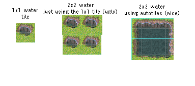
Figure 10: Autotiles look-up which tile to use based on neighboring tiles (here typically based on the 3x3 nearby tiles). This often looks nicer than just reusing the same 1x1 tile.
In many cases, we want our tiles to look (and perhaps even behave) differently depending on neightboring tiles. Autotiles are a way to solve this problem. Basically, it is a map from neighboring tile configurations to a specific tile. A basic autotile only cares if a neighbouring tile is occupied or not, so we can represent it as a bitmask where a bit is either true or false. For 3x3 autotiles (the only thing I ever use), we'll only consider the neighboring cardinal (east, west, etc) and diagonal (northeast…) tiles, as well as the 'center' position, so we use 9 bits. The 9-bit bitmask is typically represented as a 3x3 grid on top of a cell, representing the direction of the neighboring tiles the bits represent.
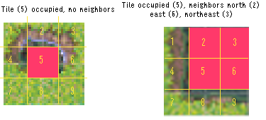
Figure 11: Some examples of tiles in the 3x3 autotile from the example of the previous figure, with the masks laid on top of the sprites of the tiles. For each tile, we specify which of the 3x3 neighboring cells should be occupied or unoccupied. The game then automatically picks the correct tile based on this information.
Note that for 'simple' autotiles, '5' (representing the tile under consideration) will always be filled, since it often doesn't make much sense to think about what tile to place in a position if that position is empty.
The 'hole' autotile for Eientei is particularly simple, so let's use it as an example. It only cares about whether it has a non-hole tile above it or not, and otherwise always use the same tile. Holes with more complicated edges will likely need a full set of autotile tiles.
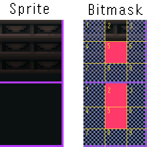
Figure 12: The hole autotile from Eientei has just two tiles, depending on whether the hole has another hole above it or not. The semi-filled masks means that that neighboring cell can be either a hole or not - it does not matter and the same hole will be used in either case.
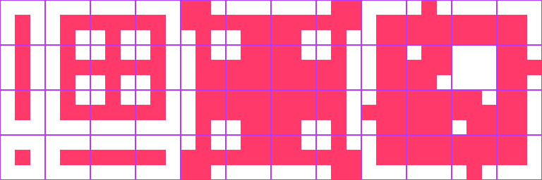
Figure 13: Simple full 3x3 autotile bitmask template. Each tile (except the empty one) needs to have a sprite, generally. There are tools (like TileSetter) to automate this based on a border and bulk sprite, assuming rotational symmetries, etc.
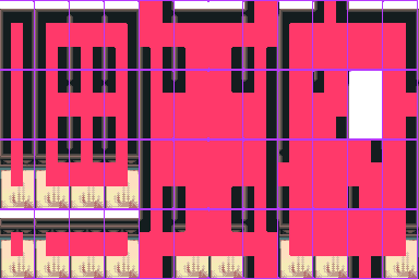
Figure 14: The wall autotile format used in the jam version of the game, with some extra visual guides overlaid on the tiles. Autotiling is used to place the correct wall tile based on whether. The mask in each cell represents a 3x3 grid, where pink indicates whether a square in the grid is occupied by a wall or not. So the lower left corner is the tile used for a wall with no surrounding walls, while the cell to its right represents a wall with no other wall beside it except one to the right, and so on.
The wall autotile in the jam version uses everything we've discussed so far: the cell size is 32x32, but the sprites are 32x64 (but has transparency for the top part, so it never covers the full 64 pixels). The sprite is offset so that it sticks up from the tile where it is placed, but the collisions are only for the bottom 32x32 part of the sprite. Note that half of sprite of a tile which has a wall in the cell to their south will be covered, as the sprite of the tile in the cell to the south extends a full 64 pixels up. This doesn't really matter, since we are covering walls with walls that look the same, but we could have drawn less pixels if we were clever. The walls with no wall tiles in the cell to the north are shorter, to make sure not to cover any non-wall tile.
If we wanted the walls to cast shadows, we'd have to extend also extend the sprites down/left/right (96x96 would be easiest). To make shadows, we'd add semi-transparent black to tiles next to non-wall tiles to darken the tiles rendered underneath (like the floor tiles). The 96x96 area would be mostly empty, since we only want some shadows to extend slight below and left/right, but I like to work with square tiles.